Reading Time: minutes
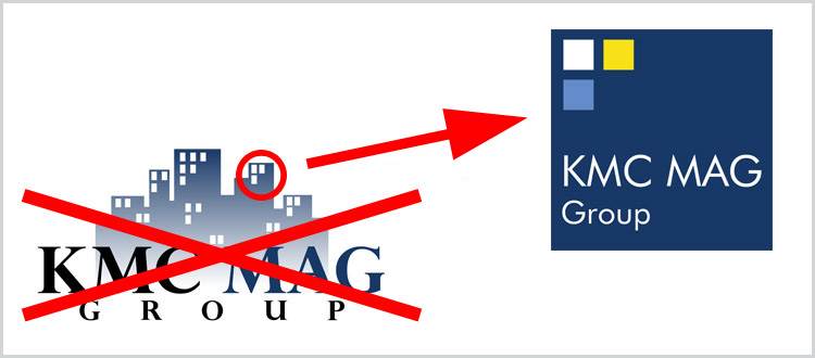
Award-winning real estate services firm KMC MAG Group is starting the year off with positive change by unveiling the firm's meaningful new logo. Veering away from its trademark logo with a gradient blue and white logo background, the new logo is now a solid block of blue with three small colored squares on the upper left side. These colors represent the premium that the company places on peace, tranquility, and happiness.
KMC's Vice President for Marketing, Yves Luethi, headed the design process. He expressed the importance of the new logo for the company. "Well, it's been four years since the company was established, and we feel like we have evolved so much since then. We have more services now, a lot more employees, and even a new office. We have also streamlined our mission-vision. With all these changes, we felt like it was time to have a new logo. Something that represented the company more accurately at this point,"
The new logo has no gradient figures in the background. Its direct and bold theme conveys the power of unity, stability, and confidence.
"Right now, we do feel like we're on top of our game. The company is doing very well and we intend to keep it that way. We are a serious and motivated real estate services firm that takes pride in the growth and happiness of our employees. That is well-symbolized by the sudden pop of yellow amidst the serious blue background," emphasizes Luethi.
KMC MAG Group plans to spread its logo throughout the Metro Manila area and to share the symbolic logo with the business world.

